A year month picker component for react native.
import yearMonthPicker.js file to your project.
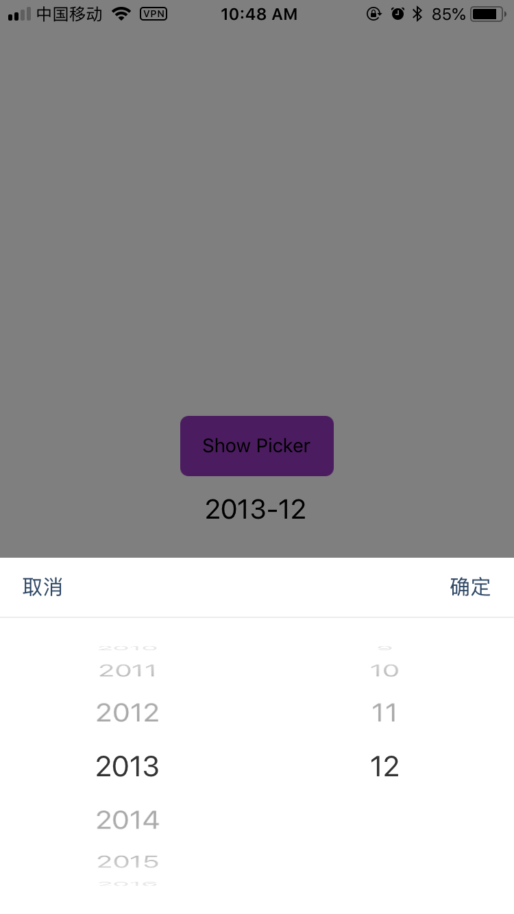
detail usage you can check for the example.js file.
or open this snap in expo
| import React, { Component } from 'react'; | |
| import { Text, View, StyleSheet, Picker, Dimensions, TouchableOpacity } from 'react-native'; | |
| import YearMonthPicker from './yearMonthPicker'; | |
| // or any pure javascript modules available in npm | |
| const Screen = Dimensions.get('window'); | |
| export default class App extends Component { | |
| constructor(props) { | |
| super(props) | |
| this.state = { | |
| startYear: 2000, | |
| endYear: 2018, | |
| selectedYear: 2018, | |
| selectedMonth: 5, | |
| } | |
| } | |
| showPicker = ()=> { | |
| const { startYear, endYear, selectedYear, selectedMonth } = this.state; | |
| this.picker | |
| .show({startYear, endYear, selectedYear, selectedMonth}) | |
| .then(({year, month}) => { | |
| this.setState({ | |
| selectedYear: year, | |
| selectedMonth: month | |
| }) | |
| }) | |
| } | |
| render() { | |
| const {selectedYear, selectedMonth} = this.state; | |
| return ( | |
| <View style={styles.container}> | |
| <TouchableOpacity | |
| style={styles.showPickerBtn} | |
| onPress={this.showPicker} | |
| > | |
| <Text>Show Picker</Text> | |
| </TouchableOpacity> | |
| <Text style={styles.yearMonthText}>{selectedYear}-{selectedMonth}</Text> | |
| <YearMonthPicker | |
| ref={(picker) => this.picker=picker} | |
| /> | |
| </View> | |
| ); | |
| } | |
| } | |
| const styles = StyleSheet.create({ | |
| container: { | |
| flex: 1, | |
| alignItems: 'center', | |
| justifyContent: 'center', | |
| backgroundColor: '#fff', | |
| }, | |
| showPickerBtn: { | |
| height: 44, | |
| backgroundColor: '#973BC2', | |
| alignItems: 'center', | |
| justifyContent: 'center', | |
| paddingHorizontal: 16, | |
| borderRadius: 6, | |
| }, | |
| yearMonthText: { | |
| fontSize: 20, | |
| marginTop: 12 | |
| } | |
| }); |
| /* | |
| * @Author: ashoka | |
| * @Date: 2018-05-20 14:40:24 | |
| */ | |
| import React, { Component } from 'react'; | |
| import { | |
| View, | |
| Picker, | |
| Text, | |
| TouchableOpacity, | |
| StyleSheet, | |
| Dimensions, | |
| Modal | |
| } from 'react-native'; | |
| const ScreenWidth = Dimensions.get('window').width; | |
| const ScreenHeight = Dimensions.get('window').height; | |
| export default class YearMonthPicker extends Component { | |
| constructor(props) { | |
| super(props); | |
| let { startYear, endYear, selectedYear, selectedMonth, visiable } = props; | |
| let years = this.getYears(startYear, endYear); | |
| let months = this.getMonths(); | |
| selectedYear = selectedYear || years[0]; | |
| selectedMonth = selectedMonth || ((new Date()).getMonth() + 1); | |
| this.state = { | |
| years, | |
| months, | |
| selectedYear, | |
| selectedMonth, | |
| visiable: visiable || false | |
| } | |
| } | |
| show = async ({startYear, endYear, selectedYear, selectedMonth}) => { | |
| let years = this.getYears(startYear, endYear); | |
| let months = this.getMonths(); | |
| selectedYear = selectedYear || years[0]; | |
| selectedMonth = selectedMonth || ((new Date()).getMonth() + 1); | |
| let promise = new Promise((resolve) => { | |
| this.confirm = (year, month) => { | |
| resolve({ | |
| year, | |
| month | |
| }); | |
| } | |
| this.setState({ | |
| visiable: true, | |
| years, | |
| months, | |
| startYear: startYear, | |
| endYear: endYear, | |
| selectedYear: selectedYear, | |
| selectedMonth: selectedMonth, | |
| }) | |
| }) | |
| return promise; | |
| } | |
| dismiss = () => { | |
| this.setState({ | |
| visiable: false | |
| }) | |
| } | |
| getYears = (startYear, endYear) => { | |
| startYear = startYear || (new Date()).getFullYear(); | |
| endYear = endYear || (new Date()).getFullYear(); | |
| let years = [] | |
| for (let i = startYear; i <= endYear; i++) { | |
| years.push(i) | |
| } | |
| return years; | |
| } | |
| getMonths = () => { | |
| let months = [] | |
| for (let i = 1; i <= 12; i++) { | |
| months.push(i); | |
| } | |
| return months; | |
| } | |
| renderPickerItems = (data) => { | |
| let items = data.map((value, index) => { | |
| return (<Picker.Item key={'r-' + index} label={'' + value} value={value} />) | |
| }) | |
| return items; | |
| } | |
| onCancelPress = () => { | |
| this.dismiss(); | |
| } | |
| onConfirmPress = () => { | |
| const confirm = this.confirm; | |
| const { selectedYear, selectedMonth } = this.state; | |
| confirm && confirm(selectedYear, selectedMonth); | |
| this.dismiss(); | |
| } | |
| render() { | |
| const { years, months, selectedYear, selectedMonth, visiable } = this.state; | |
| if (!visiable) return null; | |
| return ( | |
| <TouchableOpacity | |
| style={styles.modal} | |
| onPress={this.onCancelPress} | |
| > | |
| <View | |
| style={styles.outerContainer} | |
| > | |
| <View style={styles.toolBar}> | |
| <TouchableOpacity style={styles.toolBarButton} onPress={this.onCancelPress}> | |
| <Text style={styles.toolBarButtonText}>取消</Text> | |
| </TouchableOpacity> | |
| <View style={{ flex: 1 }} /> | |
| <TouchableOpacity style={styles.toolBarButton} onPress={this.onConfirmPress}> | |
| <Text style={styles.toolBarButtonText}>确定</Text> | |
| </TouchableOpacity> | |
| </View> | |
| <View style={styles.innerContainer}> | |
| <Picker | |
| style={styles.picker} | |
| selectedValue={selectedYear} | |
| onValueChange={(itemValue, itemIndex) => this.setState({ selectedYear: itemValue })} | |
| > | |
| {this.renderPickerItems(years)} | |
| </Picker> | |
| <Picker | |
| style={styles.picker} | |
| selectedValue={selectedMonth} | |
| onValueChange={(itemValue, itemIndex) => this.setState({ selectedMonth: itemValue })} | |
| > | |
| {this.renderPickerItems(months)} | |
| </Picker> | |
| </View> | |
| </View> | |
| </TouchableOpacity> | |
| ) | |
| } | |
| } | |
| const styles = StyleSheet.create({ | |
| modal: { | |
| position: 'absolute', | |
| top: 0, | |
| left: 0, | |
| right: 0, | |
| bottom: 0, | |
| backgroundColor: 'rgba(0, 0, 0, 0.5)', | |
| }, | |
| outerContainer: { | |
| backgroundColor: 'white', | |
| position: 'absolute', | |
| left: 0, | |
| right: 0, | |
| bottom: 0 | |
| }, | |
| toolBar: { | |
| flexDirection: 'row', | |
| justifyContent: 'space-between', | |
| alignItems: 'center', | |
| height: 44, | |
| borderBottomWidth: 1, | |
| borderColor: '#EBECED', | |
| }, | |
| toolBarButton: { | |
| height: 44, | |
| justifyContent: 'center', | |
| paddingHorizontal: 16, | |
| }, | |
| toolBarButtonText: { | |
| fontSize: 15, | |
| color: '#2d4664', | |
| }, | |
| innerContainer: { | |
| flex: 1, | |
| flexDirection: 'row', | |
| }, | |
| picker: { | |
| flex: 1, | |
| } | |
| }) |