Aka "Do we need a PhD to add images on websites ?"
I focus here on reponsive images. Loading and accessibility topics are not detailed. For the purpose of the article, I've just used the <img> markup, but for real use cases, <picture> will fill all the needs.
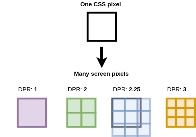
Goal: to display elements consistently on screens with different densities
To test the following sections, you need to open Development Tools, and play with different screen sizes. Be aware that the browser keeps the last image in a memory cache, you should disable the cache or refresh the page to see your expected results.
Another usefool tools to mention :
- You can inspect the network tab to see what image is loaded
- You can also select your element with the inspector, and see the sizes when you click on the element and the mouse go over the associated HTML code.
<img src="640.jpg" alt="" width="640" height="480">It's ok, but the size is fixed. For smaller screens (< 640px), the image is truncated. And if the image is inside a smaller container, the image exceed it.
 img {
  display: block; /* Make it block to change width */
  max-width: 100%; /* Fluid on smaller screens. Avoid stretching artefacts for screens bigger */
  height: auto; /* Don't stretch the image, respect the ratio */
}
Now, the image is fluid on smaller screens. But what about all other screens : tablet, desktop ?
<img
        src="640.jpg"
        srcset="640.jpg 640w,
                768.jpg 768w,
                1024.jpg 1024w,
                1280.jpg 1280w,
                1536.jpg 1536w,
                2048.jpg 2048w,
                2560.jpg 2560w,
                3072.jpg 3072w"
        alt=""
    >
The browser can now choose the image according to the size of the window. But there is a tricky hidden notion here : the device pixel ratio (DPR). On my browser, for a screen of 1024px, the image loaded is 2048px ...

The best image is 2048px instead of 1024px because my DPR is 2. It means for one standard pixel, my browser can display 4. See this explanation from Understanding the Device Pixel Ratio:
In fact, the srcset attribute allows the browser to choose the image according to the size AND the pixel ratio of the current device, thanks to the w descriptor. That's why it is a very useful and sophisticated tool.
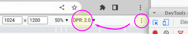
To know you DPR, two possibilities as I know :
- write
window.devicePixelRatioon the Console (DevTools) - or in DevTools, display the aspect ratio, in the "three dots" menu :
The downsides :
- For mobile devices, the DPR might be 2 or more. The output is quite counterintuitive: they have less power but they might load bigger images...
- Also, there might be some sizes differences between the choosen image and the expective one, due to the finite and discret list of sizes. For a screen of 1401 px, the image loaded is 2560px; for a screen of 1402px, the image loaded is 3072, instead of 2804px.
- There is another
sizesattribute that we don't use yet. By default, the value is "100vw". Here, for a very big screen of 2560px, the image loaded will be 3072px, the last bigger image of my list, instead of 2560px*2=5120px. The result might be blurry...
In real use case, it is very rare to display an image without a container which will adapt its content to the differents screen sizes.
Add a minimal container to the CSS :
.container {
	max-width: 1536px;
        margin-inline: auto; /* center */
}
And insert the img inside a container element:
<main class="container">
	<img src="..." srcset="..." alt="" >
</main>
Now, the image is not stretched for bigger screens.
The typical use case of this image might be the header section of an article or a hero page. Often, we need also some flex or grid layouts with one, two, or more columns depending of the screen sizes. Let's see what happens.
.grid {
	display: grid;
        grid-template-columns: repeat(2, 1fr);
}
And insert two images inside a grid section :
<main class="container">
    <section class="grid">
    <img
        src="640.jpg"
        srcset="640.jpg 640w,
                768.jpg 768w,
                1024.jpg 1024w,
                1280.jpg 1280w,
                1536.jpg 1536w,
                2048.jpg 2048w,
                2560.jpg 2560w,
                3072.jpg 3072w"
        alt="">

    <img
        src="640.jpg"
        srcset="640.jpg 640w,
                768.jpg 768w,
                1024.jpg 1024w,
                1280.jpg 1280w,
                1536.jpg 1536w,
                2048.jpg 2048w,
                2560.jpg 2560w,
                3072.jpg 3072w"
        alt=""
    >
    </section>
</main>
The output is not optimized at all. We might thought that for a screen of 1280px with two columns my browser choose the 1280.jpg image, but as I mentioned earlier, it take by default "100vw", so we have two images loaded of 2560px.
The solution is to use the "sizes" attribute with : sizes="50vw". Now the images loaded are 1280px. It's better. But, what if our layout is reponsive, like the majority of current sites.
We would like one column for screens smaller than 1024px and two columns for bigger ones.
.grid {
	display: grid;
	grid-template-columns: repeat(1, 1fr);
}

/* Mobile First */
@media (min-width: 1024px) {
	.grid {
		grid-template-columns: repeat(2, 1fr);
	}
}
If we leave the parameter as it is, the image size is always "50vw", even if the grid is in one column for smaller devices. We need to add a media query inside the sizes attribute to choose 100% instead of 50%.
Here the implementation:
sizes="(max-width: 1023px) 100vw, 50vw"The result is not optimal for big screens. For a 2536px screen, with my container max-width of 1536px and 2 columns, we should expect an image around 1536px (in DPR 2), but we have 2 images of 2536px (50vw).
We could constrain the bigger screen after the max-width of the container
sizes="(max-width: 1023px) 100vw, (max-width: 1536px) 50vw, 768px"For performance optimization, the customization of <img> or <picture> should depend on responsive breakpoints, using different set of image sizes. Here, we have to find the balance between details optimizations and usability.
Some implementations of responsive images.
Vercel
<img
        alt=""
        loading="lazy"
        width="700"
        height="475"
        decoding="async"
        style="color:transparent;width:100%;height:auto"
        sizes="100vw"
        srcset="640.jpg 640w,
        750.jpg 750w,
        828.jpg 828w,
        1080.jpg 1080w,
        1200.jpg 1200w,
        1920.jpg 1920w,
        2048.jpg 2048w,
        3840.jpg 3840w"
        src="3840.jpg"
/>
unpic
<img
  alt=""
  loading="lazy"
  decoding="async"
  sizes="(min-width: 800px) 800px, 100vw"
  srcset="
    1600.jpg 1600w,
    1280.jpg 1280w,
    1080.jpg 1080w,
    960.jpg 960w,
    828.jpg 828w,
    800.jpg 800w,
    750.jpg 750w,
    640.jpg 640w
  "
  src="800.jpg"
  style="
        object-fit: cover;
        max-width: 800px;
        max-height: 600px;
        aspect-ratio: 1.33333 / 1;
        width: 100%;"
/>
Builder.io (blog)
<picture>
  <source type="image/avif" srcset="100.avif 100w, 200.avif 200w, 400.avif 400w, 800.avif 800w" />
  <source type="image/webp" srcset="100.webp 100w, 200.webp 200w, 400.webp 400w, 800.webp 800w" />
  <img src="image.png" srcset="100.png 100w, 200.png 200w, 400.png 400w, 800.png 800w"
    sizes="(max-width: 800px) 100vw, 50vw"
    style="width: 100%; aspect-ratio: 4/3"
    loading="lazy"
    decoding="async"
    alt=""
  />
</picture>
WordPress Reference
<picture>
	<!-- Large art direction -->
	<source media="(min-width: 800px)"
		srcset="medium.jpeg 600w,
				large.jpeg 1000w,
				extra-large.jpeg 1200w,
				extra-extra-large.jpeg 1500w,
				super-large.jpeg 2000w"
		sizes="(min-width: 60rem) 60rem, 100vw">
	<!-- Small art direction -->
	<source
		srcset="tiny.jpeg 150w,
				small.jpeg 300w,
				medium.jpeg 600w,
				large.jpeg 1000w"
		sizes="100vw">
	<!-- Fallback image for browsers that don't support the picture element -->
	<img src="medium.jpeg 600w"
		srcset="tiny.jpeg 150w,
				small.jpeg 300w,
				medium.jpeg 600w,
				large.jpeg 1000w,
				extra-large.jpeg 1200w,
				extra-extra-large.jpeg 1500w,
				super-large.jpeg 2000w"
		sizes="(min-width: 60rem) 60rem, 100vw">
</picture>
IE11 Fallback
<picture>
  <source srcset="image-large.webp" media="(min-width: 1200px)" type="image/webp">
  <source srcset="image-medium.webp" media="(min-width: 768px)" type="image/webp">
  <source srcset="image-small.webp" type="image/webp">
  <!--[if IE 11]>
    <img src="image-fallback.jpg" alt="Fallback Image">
  <![endif]-->
  <img src="image-small.jpg" alt="Small Image">
</picture>- https://www.builder.io/blog/fast-images
- https://blog.webdevsimplified.com/2023-05/responsive-images/
- https://betterprogramming.pub/how-to-optimize-images-for-usage-in-websites-9eaee88c2e6b
- https://www.11ty.dev/docs/plugins/image/
- https://www.twicpics.com/blog/optimizing-the-image-element-lcp
- https://web.dev/learn/images/
- https://web.dev/learn/design/responsive-images/
- https://nextjs.org/docs/basic-features/image-optimization
- https://web.dev/optimize-cls/#images-without-dimensions
- https://jakearchibald.com/2022/img-aspect-ratio/#width--height-presentational-hints
- https://blog.logrocket.com/jank-free-page-loading-with-media-aspect-ratios/
- https://www.oddbird.net/2022/08/18/cq-syntax/
- https://kurtextrem.de/posts/modern-way-of-img