- Use sparingly. Even a subtle shadow forces extra paint work; animated or large-blur shadows can trigger repaints every frame.
- Prefer small offsets + zero/low blur for contrast on light text.
- Avoid stacking multiple shadows on long passages; reserve for headings or UI labels.
.heading {
  text-shadow: 0 1px 0 rgb(0 0 0 / 25%);
}
Why: Shadows increase paint cost; heavy blur increases rasterization time.
- Text is typically painted, not composited. Effects that change glyph appearance (shadows, filters) re‑paint text.
will-changerarely helps text; it can worsen memory usage.- Prefer color contrast and font weight over effects.
.body {
  color: oklch(30% 0.02 260); /* perceptual contrast without effects */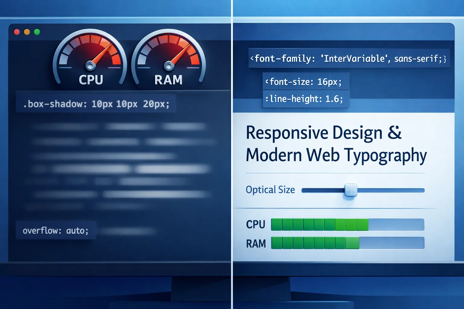
}- One variable font often replaces many static files → fewer requests, better caching.
- Optical sizing (
opsz) improves small/large text clarity automatically.
@font-face {
  font-family: "InterVar";
  src: url("/fonts/inter.var.woff2") format("woff2");
  font-display: swap;
}

.text {
  font-family: InterVar, system-ui, sans-serif;
  font-variation-settings: "opsz" 14, "wght" 420;
}
Tip: Let font-optical-sizing: auto; handle opsz when available.
swapis still the safest default for content sites.optionalworks for secondary fonts where FOUT is acceptable.- Avoid
blockunless branding absolutely requires it.
@font-face {
  font-family: "Brand";
  src: url("/fonts/brand.woff2") format("woff2");
  font-display: swap;
}-webkit-font-smoothingand-moz-osx-font-smoothingare non‑standard and platform-specific.- They can reduce legibility on modern displays and variable fonts.
- Prefer proper weights, line-height, and contrast instead.
/* Use only if you fully understand the platform tradeoff */
.subtle-ui {
  -webkit-font-smoothing: antialiased;
}- Set a stable line-height to avoid reflow during font swap.
- Use
font-size-adjust(when appropriate) to maintain x‑height consistency across fallbacks.
.text {
  line-height: 1.5;
  font-size-adjust: 0.52;
}- MDN Web Docs — font-display, variable fonts, text rendering
- W3C — CSS Fonts Module Level 4
- Google Fonts Knowledge — variable fonts & performance guidance
- Chromium Dev Blog — rendering & paint performance deep dives
Bottom line: prioritize contrast, weights, and variable fonts; treat visual effects as exceptions. Clean typography beats clever tricks for both clarity and speed.