Tiny, scoped, JS‑free modal pattern that can drop in: it uses <dialog> with :modal, styles its ::backdrop, and animates open/close with @starting-style + transition-behavior: allow-discrete;. State is declarative via a hidden checkbox, but you can swap to :target if you prefer.
<new-modal>
<!-- state (declarative) -->
<input type="checkbox" hidden aria-hidden="true">
<!-- open trigger (anywhere in your UI) -->
<label role="button">Open modal</label>
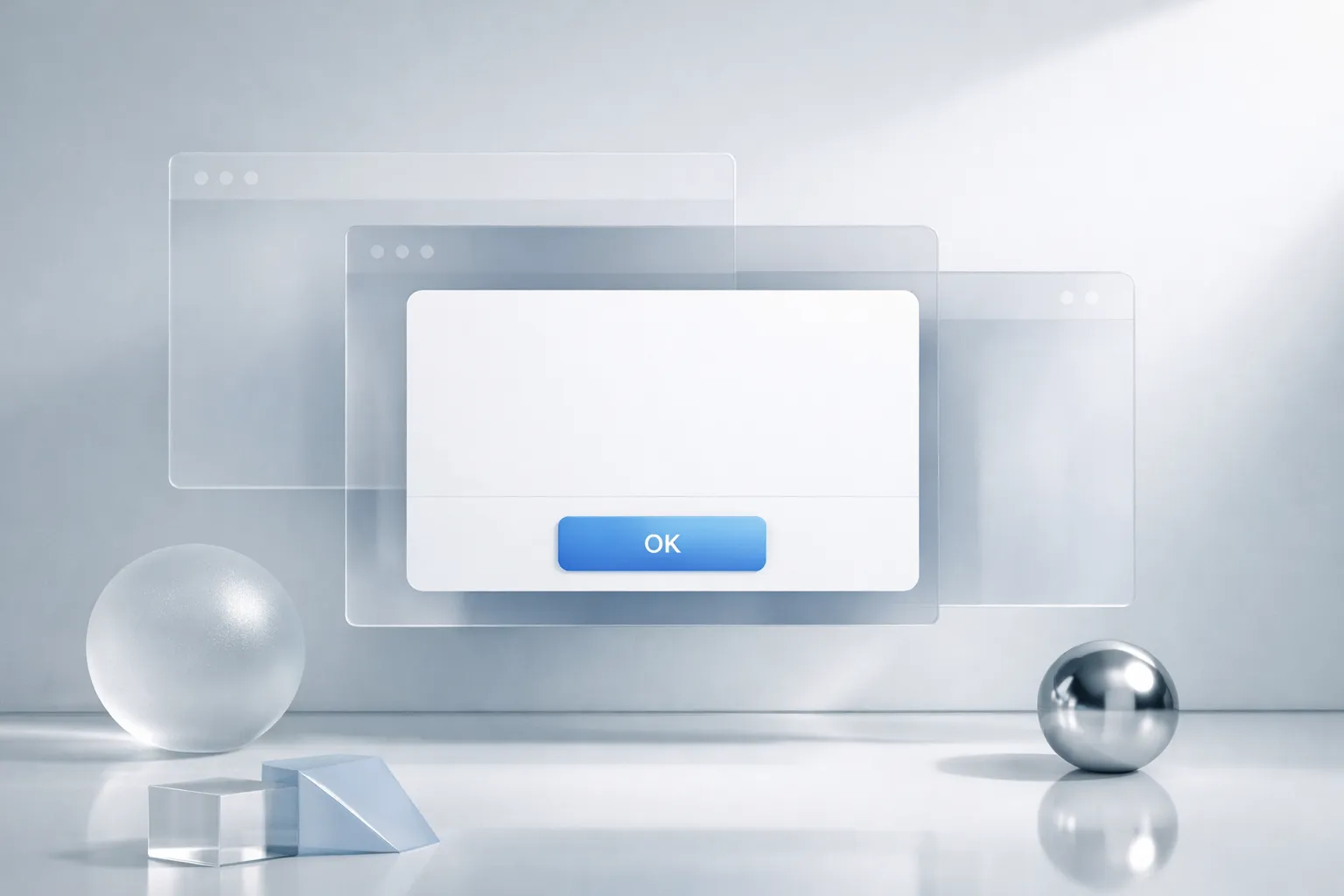
<!-- the modal -->
<dialog>
<form method="dialog">
<header>
<h2>Title</h2>
</header>
<p>Content goes here. No JS required.</p>
<!-- close trigger -->
<button>OK</button>
</form>
</dialog>
</new-modal>
<style>
/* Base tokens (optional) */
:root { color-scheme: light dark; }
/* Layout host */
new-modal { display: contents; }
/* ---------- Gate: checkbox controls dialog open ---------- */
new-modal > input:checked ~ dialog:not([open])::backdrop,
new-modal > input:checked ~ dialog:not([open]) { /* force-open with discrete transition */
/* Using the new :modal opening behavior: we “request” open via allow-discrete */
}
/* When label is activated, toggle the checkbox */
new-modal > label { cursor: pointer; }
/* Tie label to checkbox via :has() so click toggles check */
new-modal:has(> label:active) > input { /* UA toggles on mouseup; :active is a hint */ }
/* Pure CSS open/close using :has() relationship */
new-modal:has(> input:checked) > dialog {
/* show as modal */
transition-behavior: allow-discrete;
opacity: 1;
transform: scale(1);
}
new-modal > dialog {
border: none;
border-radius: .75rem;
padding: 1.25rem;
max-inline-size: 42rem;
/* start hidden */
opacity: 0;
transform: scale(.97);
/* animated open/close */
transition:
opacity 200ms,
transform 200ms;
@starting-style {
opacity: 0;
transform: scale(.97);
}
}
/* Backdrop styling */
new-modal > dialog::backdrop {
background: color-mix(in oklab, Canvas 70%, black 45%);
transition: background 200ms;
@starting-style { background: color-mix(in oklab, Canvas 90%, black 0%); }
}
/* Declarative “modal” effect without JS */
new-modal:has(> input:checked) > dialog::backdrop { /* becomes visible with dialog */
}
/* Keyboard-first UX: make trigger clearly focusable */
new-modal > label {
inline-size: fit-content;
padding: .5rem 1rem;
border: 1px solid currentColor;
border-radius: .5rem;
}
/* Close: pressing the form button dismisses the dialog semantically */
new-modal > dialog form > button {
inline-size: auto;
}
/* Optional: open dialog when checkbox is checked (no script) */
@supports selector(dialog:open) {
new-modal > dialog[open] { display: grid; }
}
/* Auto-focus the first control when opened (HTML handles it) */
new-modal > dialog form > button { }
/* Accessibility niceties */
new-modal > dialog:modal { /* pseudo-class for true modal state if UA supports it */ }
</style>- State: a hidden checkbox is the source of truth; CSS
:has()tiesinput:checkedto the dialog’s open styles. - Modal feel:
dialog::backdropgives page‑blocking overlay;:modal(where supported) provides “true” modality semantics. - Animation:
@starting-style+transition-behavior: allow-discrete;enable smooth open/close without JS hacks. - Close: the
<form method="dialog">+<button>dismisses the dialog naturally. - Swap option: prefer anchors? Replace the checkbox with an
a href="#my-modal"target +:targetgating, keeping the same CSS transitions.